Our UI UX Work
2017
Aqualens
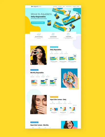
Aqualens is a Silicon Hydrogel Lens manufactured by Lenskart. The main premise of the brand is the comfort, freshness and clarity this innovative product provides. We designed the UI to lend an air of flexibility and customization for the consumers. An element of quirkiness was infused by the WCYW UI team to maintain the parent brand’s guidelines along with a refresh for the TG.
2018
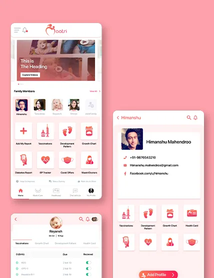
Maatri
Maatri helps build a safe and secure Health Ecosystem for mothers and their family. We worked as an extended UI and UX team for the company, sharing in-depth research and our understanding of the design and technical aspects in this space. We designed the UI for the Maatri mobile app and the website, with a great user experience that affirms their business goals.
2022
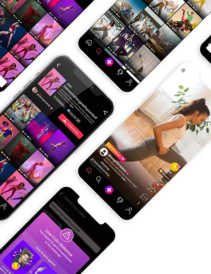
Winbee
winbee is a platform where content creators participate in unique challenges to showcase their creativity and earn rewards in return. Which Colour You Want made UI/UX & App Development easy and effortless for the brand for a seamless user experience.
2018
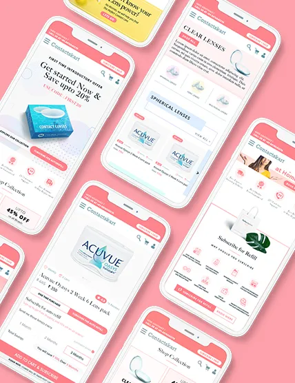
Contacts Kart
The UX team at Which Colour You Want provided a clear-cut UX process driven approach to Contacts Kart. We helped them to visualise the sitemap, map user journeys and created wireframes for the same. Our UI team then worked on the Interface design, and finally developed the mobile app as per the client’s scope and business requirements.
2016
Pet Premi
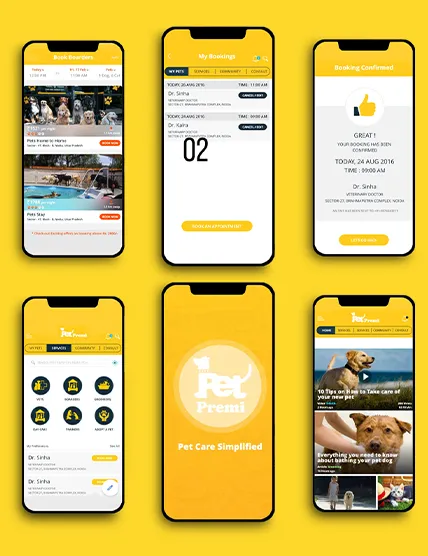
A one-of-a-kind association in itself, Pet Premi is popular among pet parents, for equipping them with a cluster of pet care services, all under the same roof. Which Colour You Want managed to establish an equilibrium between the client’s requisites and the target audience’s preferences, by ideating and testing, and paying significant attention to detail vis-à-vis relevancy, familiarity, responsiveness, an enticing call to action, and other essential features of an apt UI/UX, and eventually designed an engaging interface, to facilitate an all-inclusive app with out-of-the-ordinary features.
